
from pandas import *
import matplotlib.pyplot as plt

df=DataFrame([100,200],index=['a','b'],columns=['c'])
df.plot(kind='bar', color='b',width=0.5,rot=0,figsize=(4,4)) 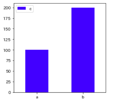
index=['a','b']
values=[100,200]

plt.figure(figsize=(4,4))
plt.bar(index,values,color='b',width=0.5)
plt.xlim(-1,2)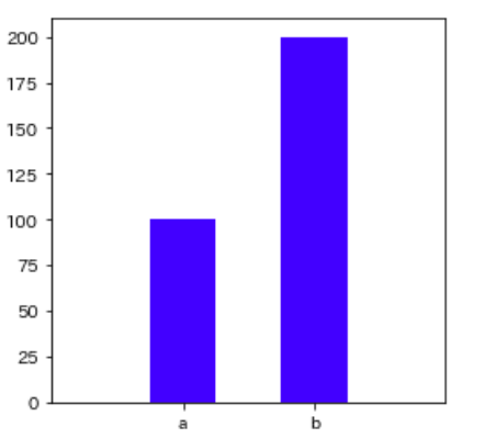
import pandas as pd
import matplotlib.pyplot as plt
plt.rcParams['font.family'] = 'IPAPGothic'
df = pd.DataFrame({ 'a':[30], 'b': [20] })
ax = plt.subplot()
df.plot.bar(stacked=True, color=['#ff5900', '#ffa500'], width=0.15,ax=ax)
plt.legend(['濃いオレンジ'])
ax.set_ylabel('数値')
plt.show()