東京都で公開されているデータをPythonにて視覚化している。
出典:東京都 新型コロナウイルス感染症検査の陽性率・検査人数(ライセンス クリエイティブ・コモンズ CC BY)
期間:2020-02-15〜2021-07-30
import pandas as pd
import matplotlib.pyplot as plt

df=pd.read_csv('tokyo_covid19.csv')
#最初の5行を表示
df.head()
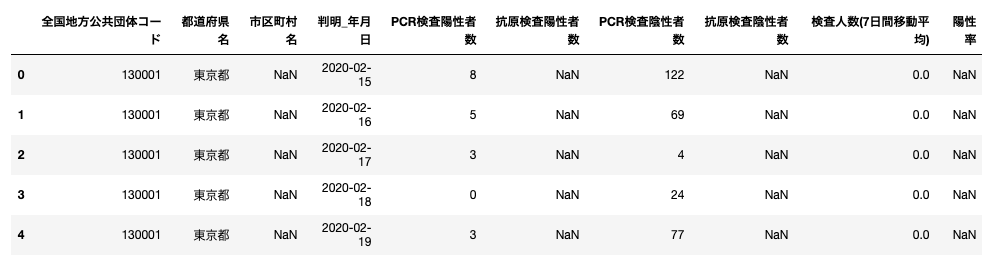
# 表から日にちと、PCR検査陽性者数の行を抽出する
df1=df[['判明_年月日','PCR検査陽性者数']]
#indexを日にちに変更する
df1.set_index('判明_年月日',inplace=True)
df1.head()

#陽性率の抽出
df2=df[['判明_年月日','陽性率']]
df2.set_index('判明_年月日',inplace=True)
df2.head()
# 2020-02-15(データの初公開b)〜2021-07-30までの陽性率
df1.plot(figsize=(15,3))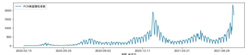
#同陽性率
df2=df[['判明_年月日','陽性率']]
df2.set_index('判明_年月日',inplace=True)
df2.plot(figsize=(15,3))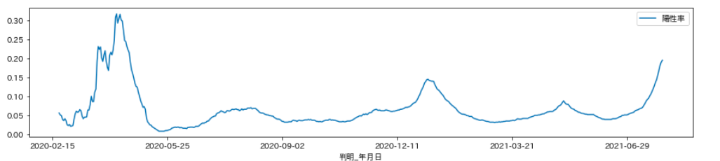
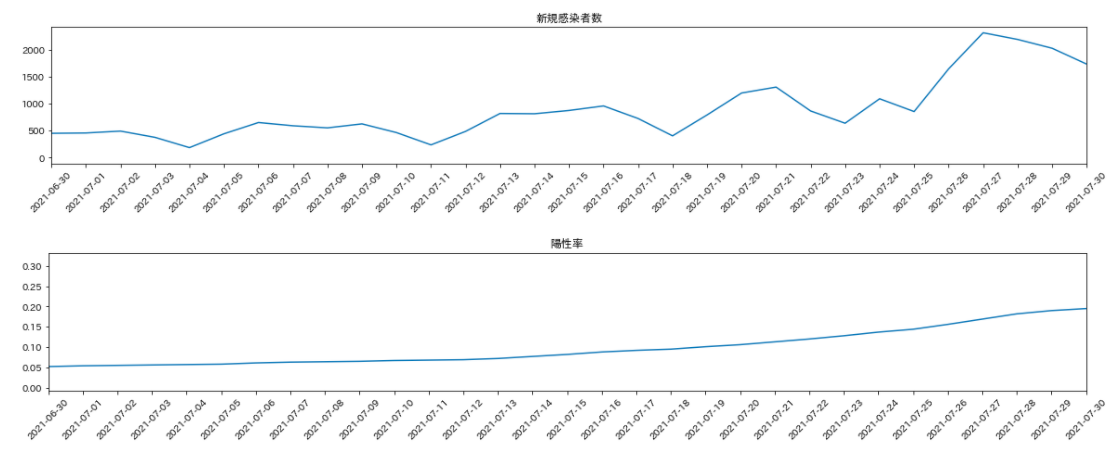
#1か月間の陽性者数
#こちらは、matplotlibでオブジェクトを作って作成
fig= plt.figure(figsize=( 20,6))
ax1=fig.add_subplot(2,1,1)
ax1.plot(df1)
ax1.set_xlim('2021-06-30','2021-07-30')
labels = ax1.get_xticklabels()
plt.setp(labels, rotation=45, fontsize=10);
ax1.set_title('新規感染者数')
#同陽性率
fig= plt.figure(figsize=(20,6))
ax2=fig.add_subplot(2,1,2)
ax2.plot(df2)
ax2.set_xlim('2021-06-30','2021-07-30')
labels = ax2.get_xticklabels()
plt.setp(labels, rotation=45, fontsize=10);
ax2.set_title('陽性率')