matplotlibで描くグラフ、たとえばy軸の目盛りを変える場合
x=[1,2,3]
y=[676,936,996]
plt.xticks([1,2,3])

# y軸:0〜最大目盛り+100

plt.ylim([0,max(y)+100])
plt.grid()
plt.plot(x,y,'ko--',)
plt.show()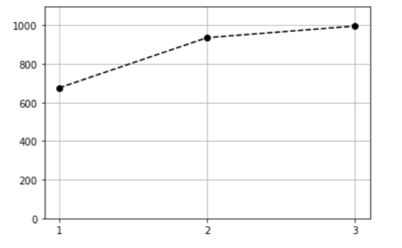

新しい行動をしよう。
matplotlibで描くグラフ、たとえばy軸の目盛りを変える場合
x=[1,2,3]
y=[676,936,996]
plt.xticks([1,2,3])
# y軸:0〜最大目盛り+100
plt.ylim([0,max(y)+100])
plt.grid()
plt.plot(x,y,'ko--',)
plt.show()